Card Guessing game with React part 9
How to make a Popup in React
In this part we will crate a decent looking Popup that will show the number that the user has picked.
For the Popup, we will create a new component. Inside components, add a new file called Popup.jsx and create a skeleton functional component.
import React from "react";

export default function Popup() {
  return <div></div>;
}
Inside the popup we will reveal the user's card and prompt the use if they want to try again or close the popup.
import React from "react";
import Card from "./Card";
export default function Popup() {
  return (
    <div>      <Card number={} />      <div>        <button>Restart</button>        <button>Close</button>      </div>    </div>  );
}
We need to pass the user's number via props for the <Card> component's num.
export default function Popup(props) {<Card number={props.number} />In order to see the result, we can temporarily display it in our App.js. Import Popup.jsx into App.js.
import Popup from "./components/Popup";Add the component right below the main div.
<div className="main">
  <Popup number={3}  />
Comment out the cards temporarily so that we will only see our popup.
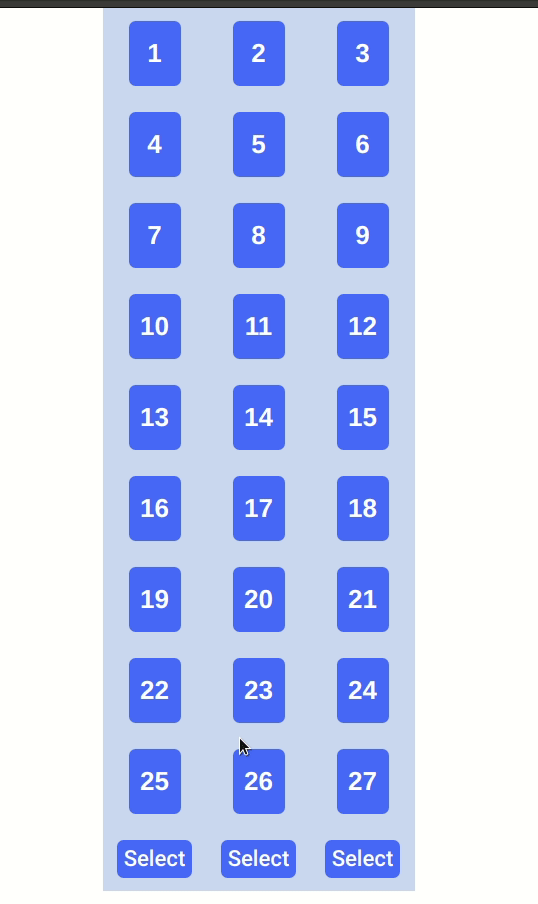
{
  /* <div className="grid-container">{this.renderGrid()}</div>
    <div className="buttons-container">
      <div className="button" onClick={() => this.execute(1)}>
        Select
      </div>
      <div className="button" onClick={() => this.execute(2)}>
        Select
      </div>
      <div className="button" onClick={() => this.execute(3)}>
        Select
      </div>
    </div> */
}
We will get something like this.

It doesn't look good. So let's do some styling.
Add a Popup.css file inside src/components/styles.
Let's add some classNames for our Popup.
<div className="container">
  <div className="content">
    <Card number={props.number} />
    <div className="btnContainer">
      <button className="btn btn-restart">Restart</button>
      <button className="btn btn-close">Close</button>
    </div>
  </div>
</div>
Let's write some CSS in Popup.css.
For container class we need the position to be fixed and the the z-index to be 1 to make it appear on top of everything. Also, we will set the top and left to 50%. This won't put the popup at the exact center yet. We still need to subtract the half of the width and height of the popup by using transform.
.container {
  position: fixed;
  z-index: 1;
  top: 50%;
  left: 50%;
  transform: translate(-50%, -50%);
}
For content we need to align the items vertically and add a few cosmetic parameters to make it look nice. It's up to you if you want to add more.
.content {
  display: flex;
  flex-direction: column;
  align-items: center;
  background-color: #84c4f5;
  padding: 30px;
  border-radius: 10px;
  box-shadow: 5px 5px 10px 3px #888;
}
For btnContainer we need to display buttons in a row and leave some top margin to make it look less clustered.
.btnContainer {
  display: flex;
  flex-direction: row;
  margin-top: 20px;
}
For btn btn-restart btn-close are self-explanatory.
.btn {
  background-color: green;
  border: none;
  border-radius: 5px;
  margin: 10px;
  width: 100px;
  height: 40px;
  font-size: 1em;
  color: white;
  box-shadow: 1px 1px 3px 1px #888888;
}

.btn-restart {
  background-color: #5670f5;
}

.btn-close {
  background-color: #d11d44;
}
Looks much better now.

But the buttons do not give some visual feedback when hovering or clicking. We can add some simple animations for that. We will add a border around the buttons and move the buttons up a bit when hovering and move back down when clicked. And also we will change the mouse pointer to finger cursor to let the user know it's clickable.
.btn:hover {
  border: 3px solid rgba(0, 0, 0, 0.25);
  transform: translateY(-3px);
  cursor: pointer;
}

.btn:active {
  transform: translateY(+3px);
}
Looking good for now. Let's try to trigger the popup when the user's number is ready to reveal, which is when the stage equals to 3. Also we need to pass the user's number, possibleNums, as well. So comment out the hard-coded props we passed to Popup.jsx for debugging purpose and replace them will correct values.
/* <Popup number={3} isVisible={true} /> */<Popup
  number={this.state.possibleNums}
  isVisible={this.state.stage === 3 ? true : false}
  />
In Popup.js, return null if props.isVisible is set to false.
export default function Popup(props) {
  if (!props.isVisible) return null;
......}
Now the popup will only show after the third select and it will show the correct number. Give it a try.
For the next part we need to reset the game to initial state when the user click Restart. We will need to pass a reset function from the App.js to Popup.jsx via props.
In the App.js add a reset function that resets the state.
reset = () => {
  this.setState({
    numbers: this.getRandNumArray(),
    possibleNums: [],
    stage: 0,
  });
};
Next pass the function to Popup.jsx via props.
<Popup
  number={this.state.possibleNums}
  isVisible={this.state.stage === 3 ? true : false}
  restartHandler={this.reset}/>
From the Popup.jsx use the new prop as onClick handler.
<button onClick={props.restartHandler} className="btn btn-restart">
  Restart
</button>
I am not sure what to do with Close button right now. Let's say a user click the button and the Popup is dismissed, the user won't be able to play the game again and kinda have to refresh the browser. It feels redundant. I might remove it later on. But let's keep it for now.
Title Photo by Clifford Photography`on Unsplash.