Card Guessing game with React part 5
Today we will be creating buttons that will rearrange columns to rows when clicked. For this part we will just add the buttons. The functionality will come in the next part. We will be using divs as buttons and they will be placed under each columns. Let's create 3 divs inside a div. I gave them class names as we are gonna do some basic styling later.
<div className="buttons-container">
  <div className="button">Select</div>
  <div className="button">Select</div>
  <div className="button">Select</div>
</div>
I want the buttons section and the cards section to be separated from the cards.
<div className="grid-container">{this.renderGrid()}</div>
<div className="buttons-container">  <div className="button">Select</div>  <div className="button">Select</div>  <div className="button">Select</div></div>
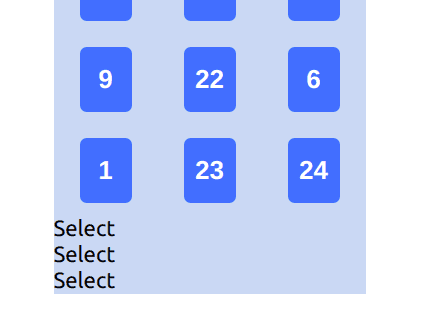
However, doing so will cause compilation error on React as below. That's because the App.js component is returning two divs instead of a single div.
In React, the returning component must be a single node. There can be many nested children inside the node. But there must be only one node. We can simply solve this by wrapping both cards div and buttons div inside a single div element. Let's call give a className of main while we are at it.
<div className="main">  <div className="grid-container">{this.renderGrid()}</div>
  <div className="buttons-container">
    <div className="button">Select</div>
    <div className="button">Select</div>
    <div className="button">Select</div>
  </div>
</div>
And we should move some of the CSS styling from grid-container into the main styling as main is now the overall content container. Basically, we just need flex-wrap inside the grid-container.
.main {  width: 240px;  margin: auto;  background-color: #cadcf3;}
.grid-container {
  /* background-color: #cadcf3; */  display: flex;
  flex-wrap: wrap;
  /* width: 240px;  margin: auto; */}
Not great, pretty terrible. The buttons should be in a row directly under their respective columns. And they have no border to look like buttons. Let's fix that.
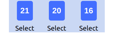
To get them to display in a row, we need to set the display to flex and width to 100% of the main div (240px). And set justify-content to space-around so that the buttons will be spaced out evenly.
.buttons-container {
  display: flex;
  width: 100%;
  justify-content: space-around;
  margin: auto;
}
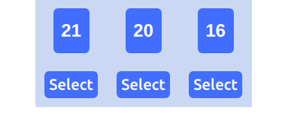
Not great, getting better. We just need some styling for the buttons. Most of the styling are self-explanatory. I added margin-top and margin-bottom as I saw the gap between the buttons and border of the main div is too close. Let me know in the comment if you need explanation for any of the styling choices.
.button {
  background-color: dodgerblue;
  border-radius: 5px;
  padding: 5px;
  margin-bottom: 10px;
  margin-top: 10px;
  font-weight: 500;
  color: white;
}Alright, I am happy with this result. I am aware that even though the positioning is solid for now the aesthetic doesn't look great. Don't worry. We will be beautifying the final product at the end. It's better to get functionality working well first and then beautify it later. That's it for today. I hope you enjoyed the tutorial :)
Title Photo by Clifford Photography on Unsplash


