
Card Guessing game with React part 3
Today we will be creating a 9x3 grid of cards from the Card component we created in part 2.
We will need to store the numbers 1 to 27. So we need to make use of the famous State of React. In order to use State the our App.js must be a class component. Unfortunately, due to my lack of foresight I created our App.js component as functional component. Not to worry, it's easy as pie to convert functional component to class component and vice versa.
Step 1 of 3
Turn
function App() {Into
class App extends Component {Step 2 of 3
Wrap return <Card number={11} />; with render()
Before
return <Card number={11} />After
  render() {
    return <Card number={11} />;
  }
Step 3 of 3
import Component.
import React, { Component } from 'react'That's it! If you did everything correctly you will get the following.
class App extends Component {
  render() {
    return <Card number={11} />
  }
}
Now we can add a State with the list of 27 numbers as an array.
state = {
  numbers: [
    1,
    2,
    3,
    4,
    5,
    6,
    7,
    8,
    9,
    10,
    11,
    12,
    13,
    14,
    15,
    16,
    17,
    18,
    19,
    20,
    21,
    22,
    23,
    24,
    25,
    26,
    27,
  ],
}
Instead of adding 27 lines of <Card> in render() we will make use of an ES6's higher order function called map(). We will remap the numbers from state.numbers into <Card>.
map takes in a callback function from which we need to return an object. In our case, <Card> will be the return object.
let's write a renderGrid function that returns the remapped components.
renderGrid = () => {
  return this.state.numbers.map(num => {
    return <Card number={num} />
  })
}
We are passing in the following callback function inside map.
num => {
  return <Card number={num} />
}
num holds the current value from the array. For example, if it is the first iteration, the value of num would be 1. If second iteration, num would be 2 and so on. So we just plug num into our Card's number props and we get 27 components of Card without having to write messy 27 lines of code :). One good practice when using map is to assign a unique number to the key prop of the returning component so that React will easily know which items are being delete/added. Instead of using just num as parameter for our callback function, we will use another parameter called index or as we all preferred to write, i. Our callback function will now look like this
;(num, i) => {
  return <Card key={i} number={num} />
}

This is not quite what we wanted. it's a 27x1 grid. We want a 9x3 grid. And it's not centered :o. Let's use CSS to fix it. Go to App.css and delete everything inside it. We will start from scratch. Add a className called container to our main <div> that wraps around the renderGrid() function.
<div className="grid-container">Then write some styling for grid-container in App.css. Let's add a background for a start. You may choose any color you like.
.grid-container {
  background-color: #cadcf3;
}
We need to set the display type to flex and use wrap for flex-wrap. With flex-wrap set to wrap, the child components will automatically move to accommodate screen sizes.
.grid-container {
  background-color: #cadcf3;
  display: flex;
  flex-wrap: wrap;
}
With the above changes, we get a flexible layout that wraps the Card components when the screen size changes.
It's better, but still not what we want. The cards try to fit it as much as column it can fit depending on the width. We want only 3 columns. From the video, we can see the optimal width for 3 columns is at about 240px. Fixing the width of grid-container to 240px should do the trick. It might cause some issue on smaller screens, but it should do for now.
.grid-container {
  background-color: #cadcf3;
  display: flex;
  flex-wrap: wrap;
  width: 240px;
}
Much much better now :)

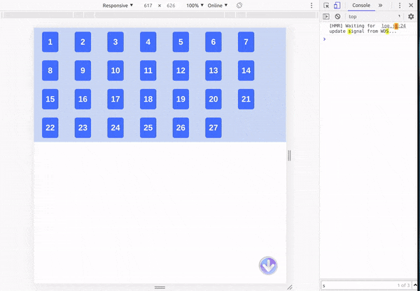
For the last step, let's center the grid by simply adding margin : auto in the .grid-container.
.grid-container {
  background-color: #cadcf3;
  display: flex;
  flex-wrap: wrap;
  width: 240px;
  margin: auto;
}
There you go, it's a centered grid with 9 rows 3 columns and we are done for part 3. See ya in part 4 :)

Title Photo by Clifford Photography on Unsplash