Card Guessing game with React part 11
Styling and Adding Instructions
In this part we will finally beautify the looks of our project. We will change the way the cards look and maybe the select buttons as well. Also, we will put guides that tell users what to do. For this part, feel free use your creativity to style in any way you think is nice.
Lets' start with the cards. The blue background color on the cards look too daunting and the font doesn't look nice. I am going use Google's Poppins font what has a nice aesthetic.
In the numStyle of Card.jsx add the following lines for font styling. I am choosing purple for the font color and the weight of 400. Again the choices are personal and you may choose your preferred color.
const numStyle = {
  fontSize: "20px",
  fontFamily: "Poppins,sans-serif",  fontWeight: "400",  color: "#3D3B90",};
For the background we will just use simple white color to contrast well with purple color and add a shadow as well. Notice I have removed color and fontFamily from the cardStyle as they are only relevant for numStyle.
const cardStyle = {
  display: "flex",
  justifyContent: "center",
  alignItems: "center",
  width: "20px",
  height: "30px",
  backgroundColor: "white",  padding: "10px",
  borderRadius: "5px",
  margin: "10px 20px",
  boxShadow:    "0 2.8px 2.2px rgba(0, 0, 0, 0.02),0 6.7px 5.3px rgba(0, 0, 0, 0.028)",};

Looks nice, but I think the background needs more contrast. Let's change the background of the container. While we are at it let's put a margin top as currently there's no gap between the container and browser window. And I will round the corner of the container as well because sharp edges of the container are an eyesore. Modify main class style as follow in the App.css.
.main {
  width: 240px;
  margin: 20px auto;  background-color: #5ab1bb;  border-radius: 5px;  padding: 10px;}

Alright, that looks great for the cards and the background. Let's move on to the buttons. For buttons we will add some padding to make the buttons bigger, change the background color and change the font. And of course add a shadow. I would like to use a different type of shadow compare to the cards as the buttons should standout more than the cards. Modify the button class styling as follow.
.button {
  background-color: #7877c7;  border-radius: 5px;
  padding: 8px;  margin-bottom: 10px;
  margin-top: 10px;
  font-weight: 500;  color: white;  font-family: "Poppins",sans-serif;  box-shadow: inset 0 -10px 0 -6px rgba(0, 0, 0, 0.17);}

Now we got nice looking buttons. Just need to add some animation. When hovering I want the buttons to move up a little big and when clicked I want the button to scale a little bigger temporarily. Oh also the cursor should become a pointer. Add the following pseudo class styling for the button.
.button:hover {
  cursor: pointer;
  transform: translateY(-3px);
}

.button:active {
  transform: scale(1.1);
}
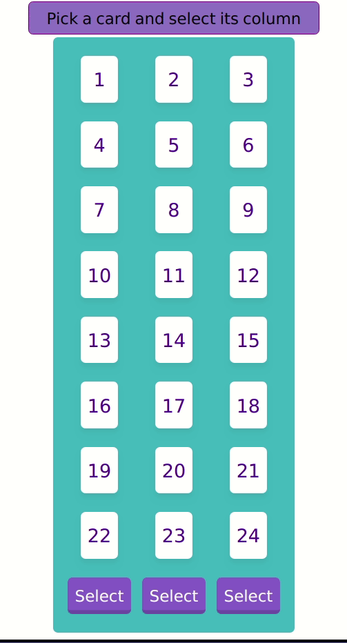
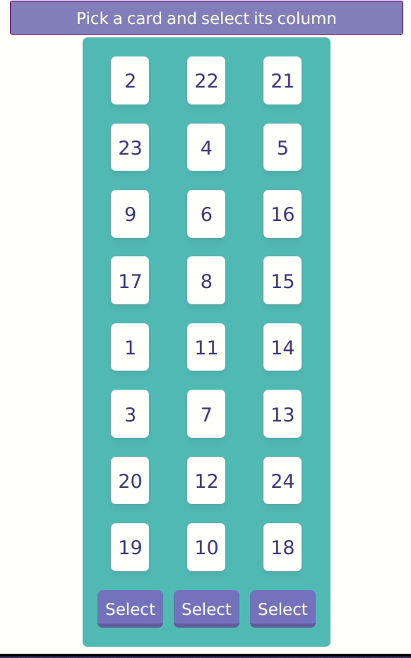
And we are done with the buttons. Let's move on to the instructions. We have an almost complete app here but a user would not know they are supposed to choose a card and select the column. We will need another div and I want the div to be outside of the main container. That means we will need to wrap the instruction div and main div inside a wrapper. It should look something like this.
<div>
  <div className="instruction">Pick a card and select its column</div>
  <div className="main">.........</div>
</div>
Add some styling for instruction in the App.css. I won't be explaining these as they are quite straightforward. Do let me know in the comment if you are unclear of this.
.instruction {
  max-width: 400px;
  margin: 3px auto;
  background-color: #8483c3;
  border: 1px solid purple;
  border-radius: 5px;
  padding: 5px;
  font-family: "Poppins",sans-serif;
  font-size: 1.2em;
  text-align: center;
  color: white;
}

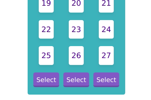
It looks okay, but you can see there are too many rows and the buttons are off screen. We can adjust the number of rows by setting the TOTAL_CARDS to 24 which will make it 8 rows in total. Change it in App.js
const TOTAL_CARDS = 24;It looks better now. But there is a big margin between the instruction and the cards. We should remove the margin (top and bottom) that we added for the main class earlier.
.main {
  width: 240px;
  margin: auto;  background-color: #5ab1bb;
  border-radius: 5px;
  padding: 10px;
}

Yup. This is enough for the styling. For the instructions, we need to change the text according to the stage. Let's add the instructions for each stage and set the current instruction in the state.
const TOTAL_CARDS = 24;
const TOTAL_COL = 3;
const CARDS_PER_COL = TOTAL_CARDS / TOTAL_COL;
const INSTUCTIONS = [ "Pick a card and select its column", "Select its column again", "Is this your card?",];this.state = {
numbers: this.getRandNumArray(),
possibleNums: [],
stage: 0,
instruction: INSTUCTIONS[0],};Add a function that will set the instruction depending on the stage. Take note that by the time this function is executed, the stage should have been incremented by 1. That's why we need to use stage + 1 in the switch statement.
setInstruction = () => {
  switch (this.state.stage + 1) {
    case 0:
      this.setState({ instruction: INSTUCTIONS[0] });
      break;
    case 1:
    case 2:
      this.setState({ instruction: INSTUCTIONS[1] });
      break;
    case 3:
      this.setState({ instruction: INSTUCTIONS[2] });
      break;
    default:
      console.log("Invalid stage " + this.state.stage + 1);
  }
};
And call it inside the execute.
execute = (colNumber) => {
  let tmp_nums = this.colToRows(colNumber);
  this.updatePossibleNums(tmp_nums.slice(CARDS_PER_COL * 1, CARDS_PER_COL * 2));
  this.setInstruction();  this.setState({ stage: this.state.stage + 1 }, this.showPopup);
};
I notice that we have a small bug inside the game loop. The user can still continue to click the button after stage 3. To fix it, we simply need to return from the function if the stage is equal to or greater than 3.
execute = (colNumber) => {
  let tmp_nums = this.colToRows(colNumber);
  this.updatePossibleNums(tmp_nums.slice(CARDS_PER_COL * 1, CARDS_PER_COL * 2));
  this.setInstruction();
  this.setState({ stage: this.state.stage + 1 }, this.showPopup);
};
Finally, remove the hard-coded instruction from the div. And don't forget to reset the instruction at reset().
<div className="instruction">{this.state.instruction}</div>reset = () => {
this.setState({
numbers: this.getRandNumArray(),
possibleNums: [],
stage: 0,
instruction: INSTUCTIONS[0], });
};Looks awesome :)
But one last thing. The Popup style looks out of place because the color scheme is different from the main screen. Let's change it to be consistent with the overall theme. It's quite easy, we just need to copy paste some css from App.css into Popup.css.
.content {
  display: flex;
  flex-direction: column;
  align-items: center;
  background-color: #8ec7ce;  border: 1px solid #7877c7;  padding: 30px;
  border-radius: 10px;
  box-shadow: 5px 5px 10px 3px #888;
}

.btn {
  background-color: green;
  border: none;
  border-radius: 5px;
  margin: 10px;
  width: 100px;
  height: 40px;
  font-size: 1em;
  color: white;
  font-family: "Poppins",sans-serif;  box-shadow: inset 0 -10px 0 -6px rgba(0, 0, 0, 0.17);}

.btn:hover {
  transform: translateY(-3px);
  cursor: pointer;
}

.btn:active {
  transform: scale(1.1);}

.btn-restart {
  background-color: #7877c7;}
That's perfect!

Let's remove the close button since we are not going to use it and let's add our punch line "Is this your card?" when showing the popup. In the Popus.jsx remove the close button from the code.
// remove this
<button className="btn btn-close">Close</button>
Add a div that encloses the text.
<div className="container">
  <div className="content">
    <div className="title">Is this your card?</div>    <Card number={props.number} />
    <div className="btnContainer">
      <button onClick={props.restartHandler} className="btn btn-restart">
        Restart
      </button>
    </div>
  </div>
</div>
Add a style for title class in popup.css.
.title {
  font-size: 1.3em;
  font-family: "Poppins",sans-serif;
  margin-bottom: 30px;
}

The text looks a bit cramped. We can fix it by setting a suitable width for the content class.
.content {
  display: flex;
  width: 250px;  flex-direction: column;
  ......;
}

Looks good! But now I realize that the Card inside the popup looks too small. Since we use custom Card component, we need to wrap it with a div to scale it (there are other ways to do it, but I believe this is the most straightforward way). And let's add some animation to it as well. Add the wrapper inside the Popup.jsx and style it inside popup.css.
<div className="cardWrapper">  <Card number={props.number} />
</div>
.cardWrapper {
animation: animScale 0.5s cubic-bezier(0.175, 0.885, 0.32, 1.275);
transform: scale(1.5);
}
@keyframes animScale {
from {
transform: scale(0);
}
to {
transform: scale(1.5);
}
}Finally, we can uncomment the shuffle part in the App.js and we get our final product. I hope you enjoyed this tutorial series. Let me know in the comment if you have any questions. The live project is available at My Github Page and the source code at Github.
Title Photo by Clifford Photography`on Unsplash.